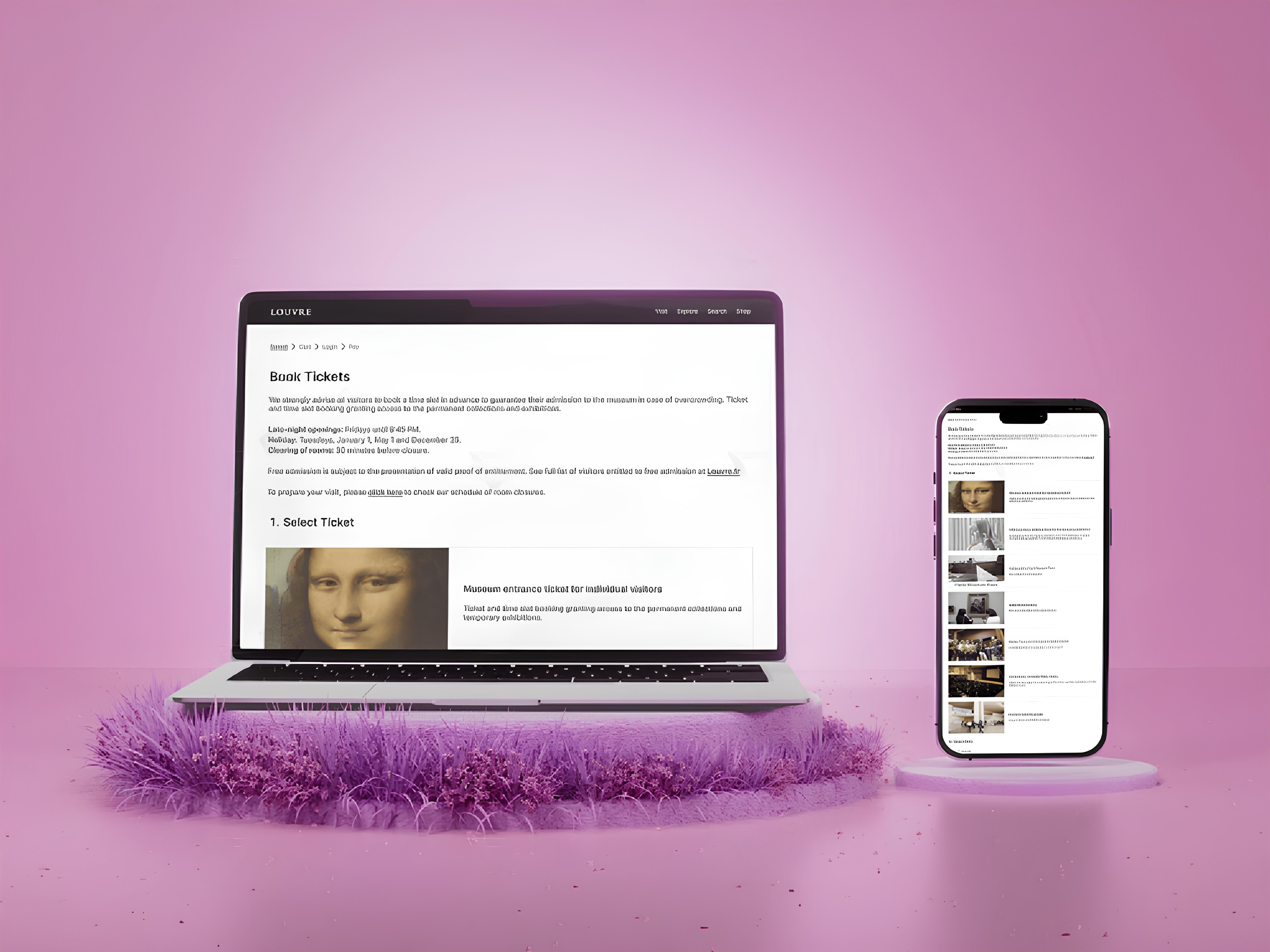

Overview
This project showcases a comprehensive redesign of the Louvre official ticket booking website, undertaken as a personal UX and web design initiative to improve user engagement and streamline the ticket purchasing process. The primary focus was on enhancing usability, visual appeal, and accessibility, ensuring that visitors could easily navigate through the site, select the appropriate tickets, and complete their bookings with minimal effort.
Problem
Cluttered and Complex Navigation: The original website had a complicated navigation structure, making it difficult for users to find relevant information or access the correct ticketing options.
Ambiguous Ticket Selection Process: The ticket options were presented in a confusing manner, leading to user frustration and errors in ticket selection.
Inconsistent Mobile Experience: The website was not fully optimized for mobile devices, resulting in a subpar user experience for those accessing the site via smartphones or tablets.
Outdated Visual Design: The original design lacked modern aesthetics and did not effectively communicate the grandeur and cultural significance of the Louvre.
Solution
Simplified Navigation Structure: The navigation was restructured to be more user-friendly, with clear categories and a streamlined path to ticket selection. This reduced the cognitive load on users, making the process of finding and purchasing tickets more intuitive.
Clear and Concise Information: Each ticket category was redesigned with clear descriptions and supporting visuals, helping users quickly understand their options and select the appropriate tickets without confusion.
Responsive and Mobile-Friendly Design: The redesign focused on creating a fully responsive experience, ensuring that users could easily navigate the site and complete transactions on mobile devices with optimized touch interactions and faster load times.
Modernized Visual Aesthetics: The visual design was updated to reflect a more modern and minimalist aesthetic, incorporating high-quality images, clean typography, and a cohesive color palette that aligns with the Louvre’s brand identity.
This not only improved the site's visual appeal but also enhanced its overall user experience by making it more engaging and easier to navigate.
Evolution of the Solution
Having identified a solution to the present problem, I set about a thorough refurbishment of the Louvre Museum ticket booking website low-resolution layouts. Here are the freshly configured low-definition schemas with the high-definition designs, each one adaptive in design.