Overview
Welcome to the journey of CycleEase, a revolutionary bicycle shopping app designed to redefine the way people shop for bicycles and accessories while focusing on their health concerns and needs. This user-centric platform unites shopping, maintenance and community engagement, offering a holistic solution for individuals with health needs and cycling enthusiasts alike. It is empowering peoples with physical limitations to live healthier, more active lives by making cycling more accessible and enjoyable. It is a transformative journey where health and exploration converge.
Problem
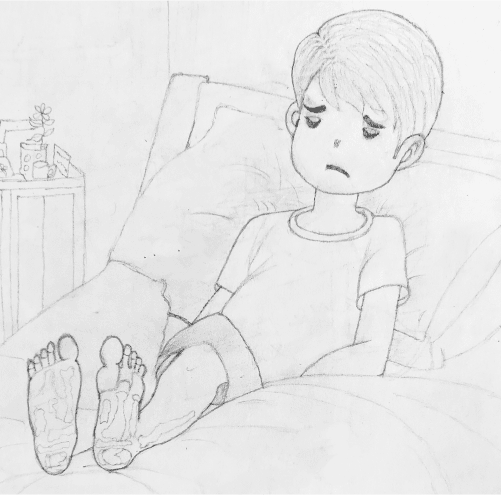
Many individuals grappling with health conditions like arthritis, obesity, diabetes, and others are prevented from enjoying outdoor activities due to associated pain and unease, limiting their liberty to roam and discover.
Presently, there is a significant shortage of a comprehensive mobile app in the market, combining features such as purchasing bicycles and associated equipment, offering maintenance support, and encouraging community interaction.
In today's diverse market, cyclists face an overwhelming assortment of options, transforming the decision into a time-consuming process.
The absence of a handy, comprehensive application exacerbates this issue, impeding the enhancement of the global cycling fraternity.
Solution
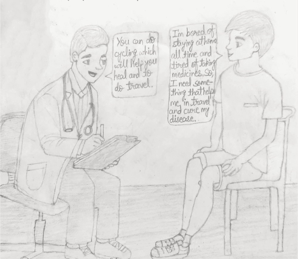
Cycling is a low-impact exercise that will be useful for healing and traveling.
Implement a smart filtering system in the app., enabling users to easily discover bicycles designed to address specific health concerns promoting inclusivity and accessibility.
Develop a comprehensive app that seamlessly combines bicycles and accessories shopping, maintenance services and community engagement.
Introduce organized selections and personalized recommendations to simplify the overwhelming choices for cyclists.
Enhance the user interface with intuitive design, providing a user-friendly platform that fulfill user needs.
Interviews
To understand the diverse needs of potential users, a series of interviews were conducted in qualitative research. During this research, I conducted interviews of 7 potential participants including kids, teens, adults and seniors. I navigated the unique perspectives of health patients, bicycle enthusiasts and seasoned cyclists. I prepared an interview script with 20 open-ended questions, focusing on our target audience's needs, pain points and challenges.
Key Insights
Users especially those with specific health concerns expressed a desire for bicycles tailored to their specific health needs
Maintenance is a pain point, users struggle to find reliable and efficient maintenance services, highlighting a gap in the current cycling ecosystem.
Community engagement is seen as a motivator, especially for those seeking support in their health journeys.
Frustration exists in navigating multiple apps for different cycling needs, they expressed a clear desire for an all-in-one solution.
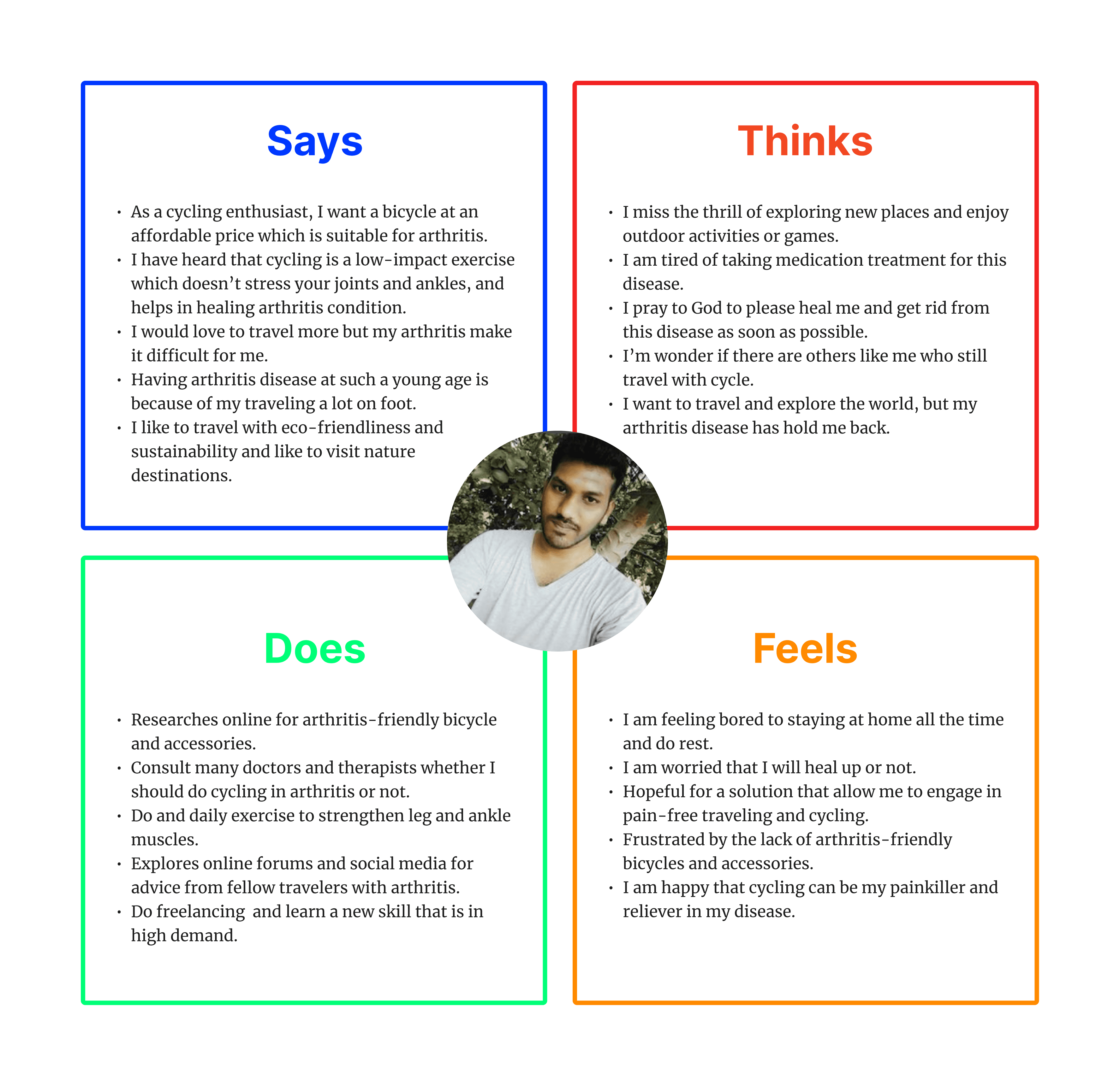
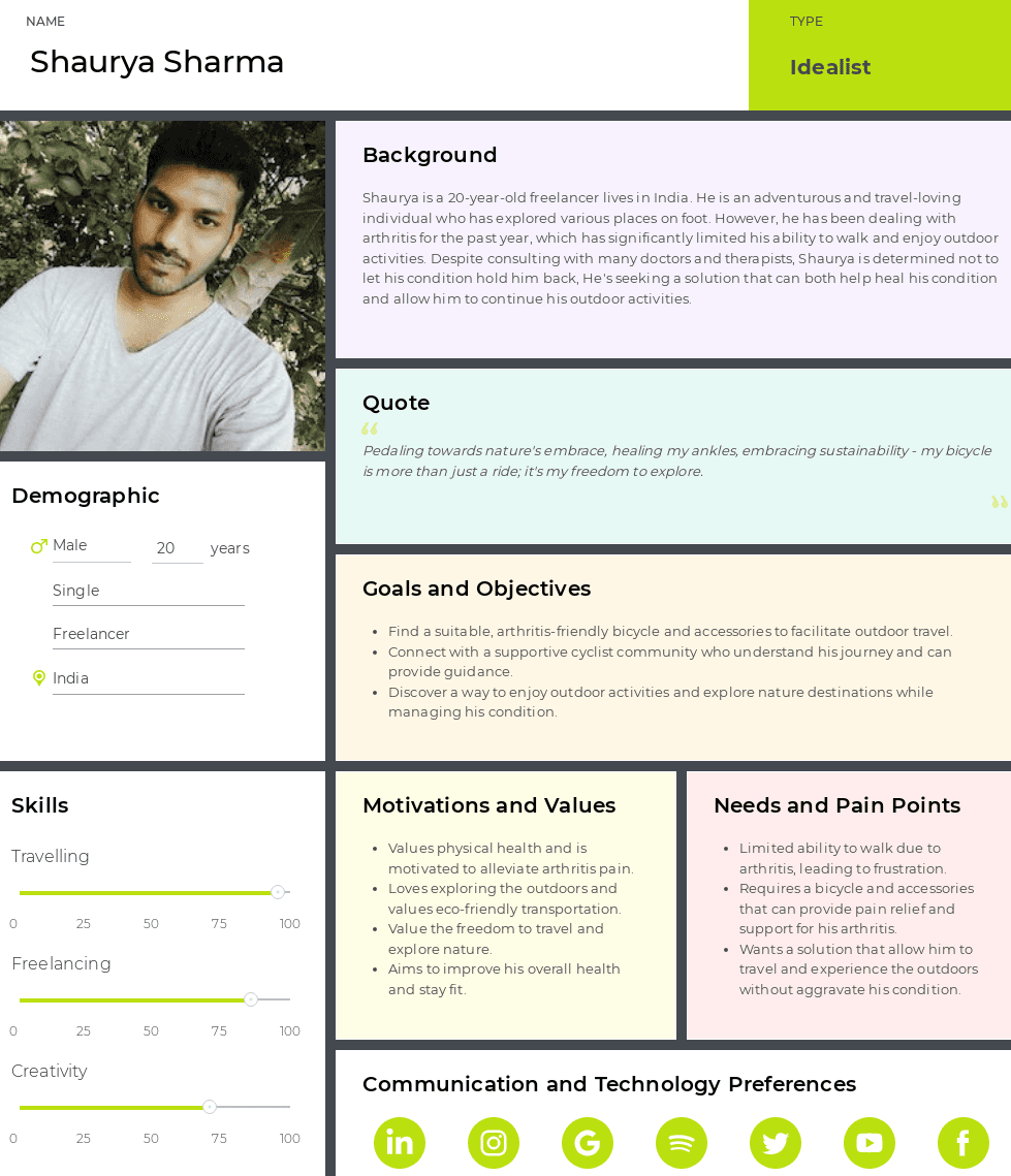
Empathy Map
Through my interactions, I constructed an empathy map, divided user pain points and aspirations into four sections- Says, Thinks, Does and Feels. Shaurya's empathy map, for instance, vividly highlighted his struggle with limited mobility due to ankle pain. Insights like this became the emotional compass guiding app's design.
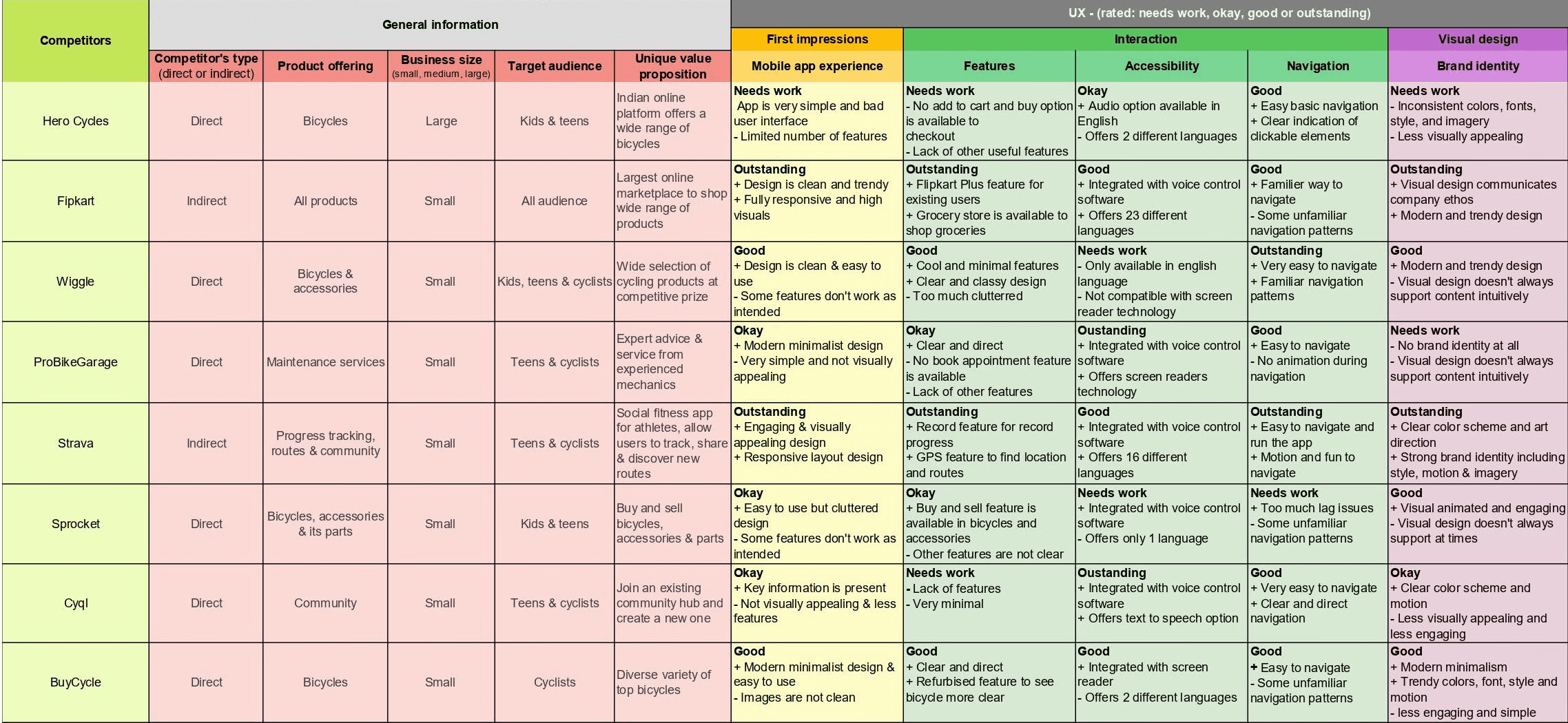
Competitive Audit
After survey session was over, I deep dived into existing apps which was my direct and indirect competitors. I discovered pros and cons of each app. Some focused entirely on shopping, while others offered maintenance services and community in isolation. None provided a cohesive, end-to-end experience. This void in the market fueled my determination to offer something truly unique.
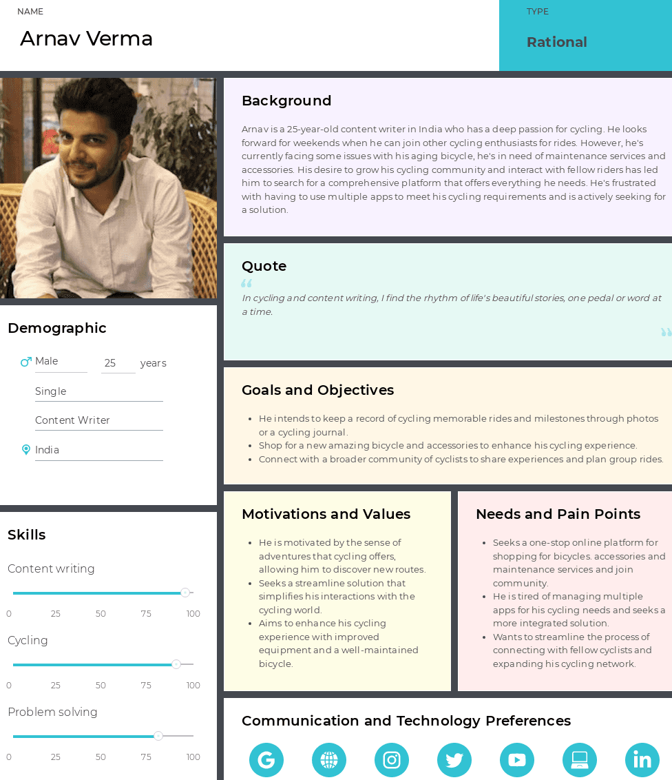
User Persona
After empathy mapping, I built user personas of two users- Shaurya and Arnav. Their health challenges, aspirations and frustrations became the heartbeat of my design, ensuring every feature addressed their unique needs.
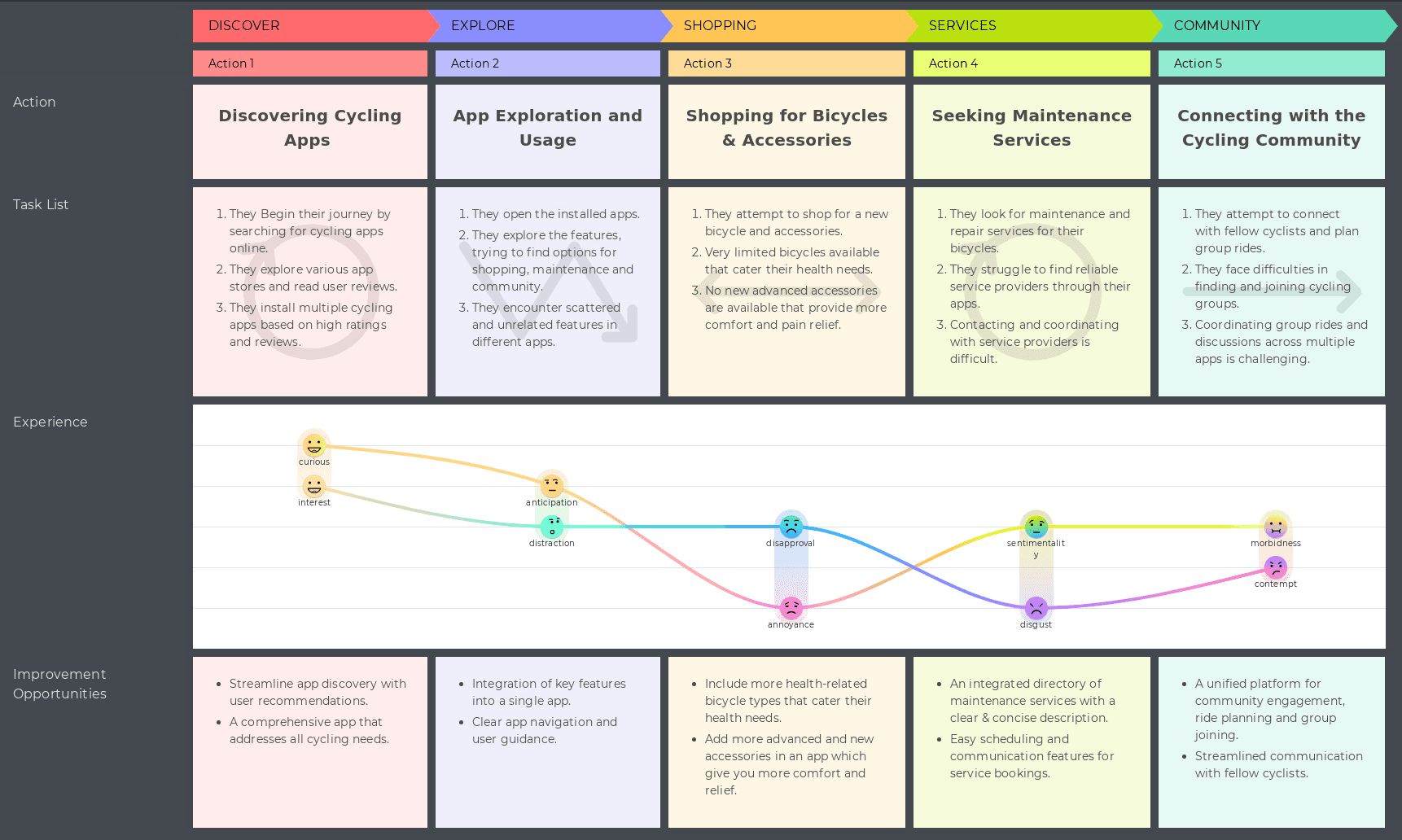
User Journey Map
I carefully mapped both users journey- from initial desire to explore nature to the frustration of navigating disjointed apps. This visual narrative allowed us to identify key touchpoints and moments of opportunity, shaping our app's seamless flow.
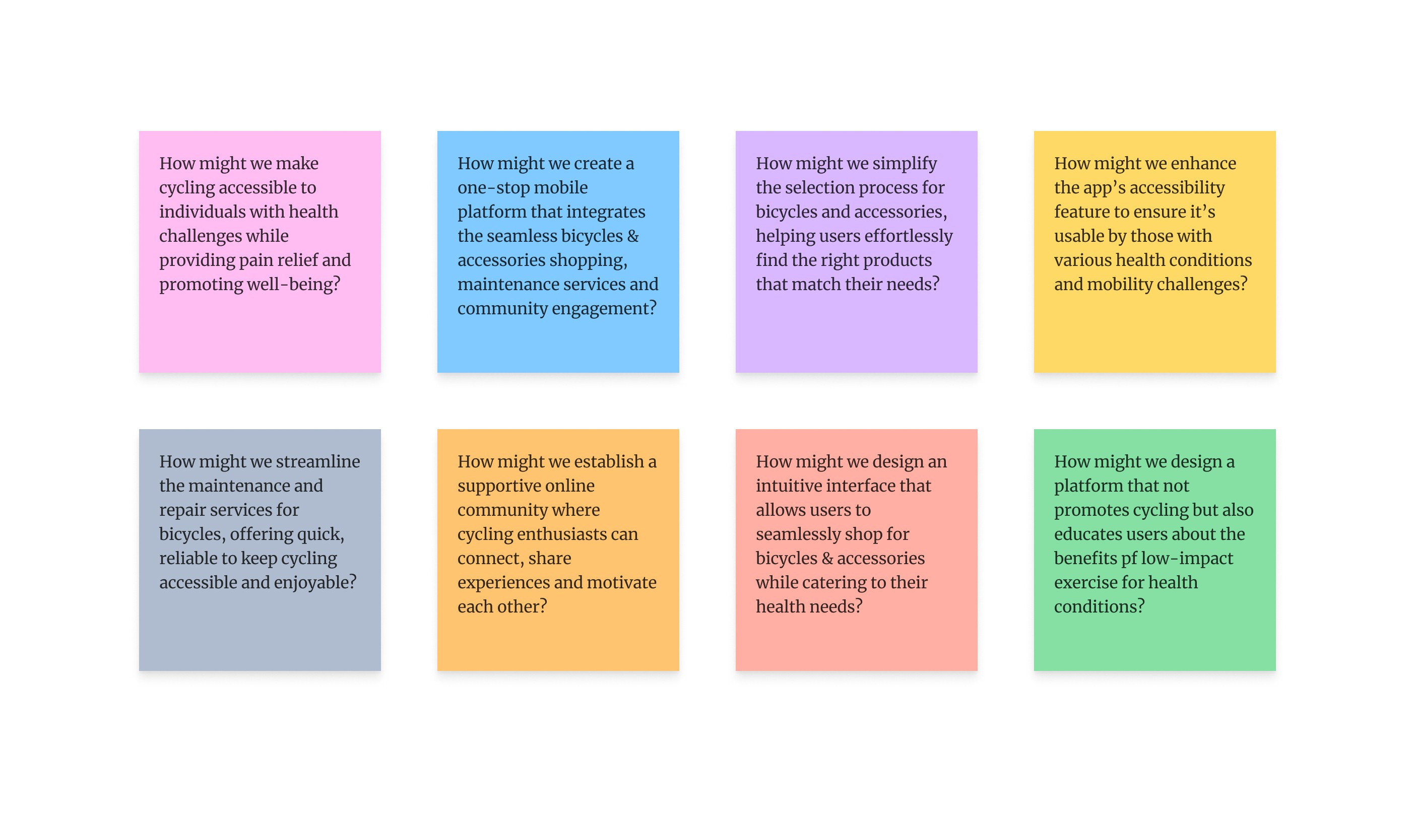
How Might We Ideas
I carefully mapped both users journey- from initial desire to explore nature to the frustration of navigating disjointed apps. This visual narrative allowed us to identify key touchpoints and moments of opportunity, shaping our app's seamless flow.
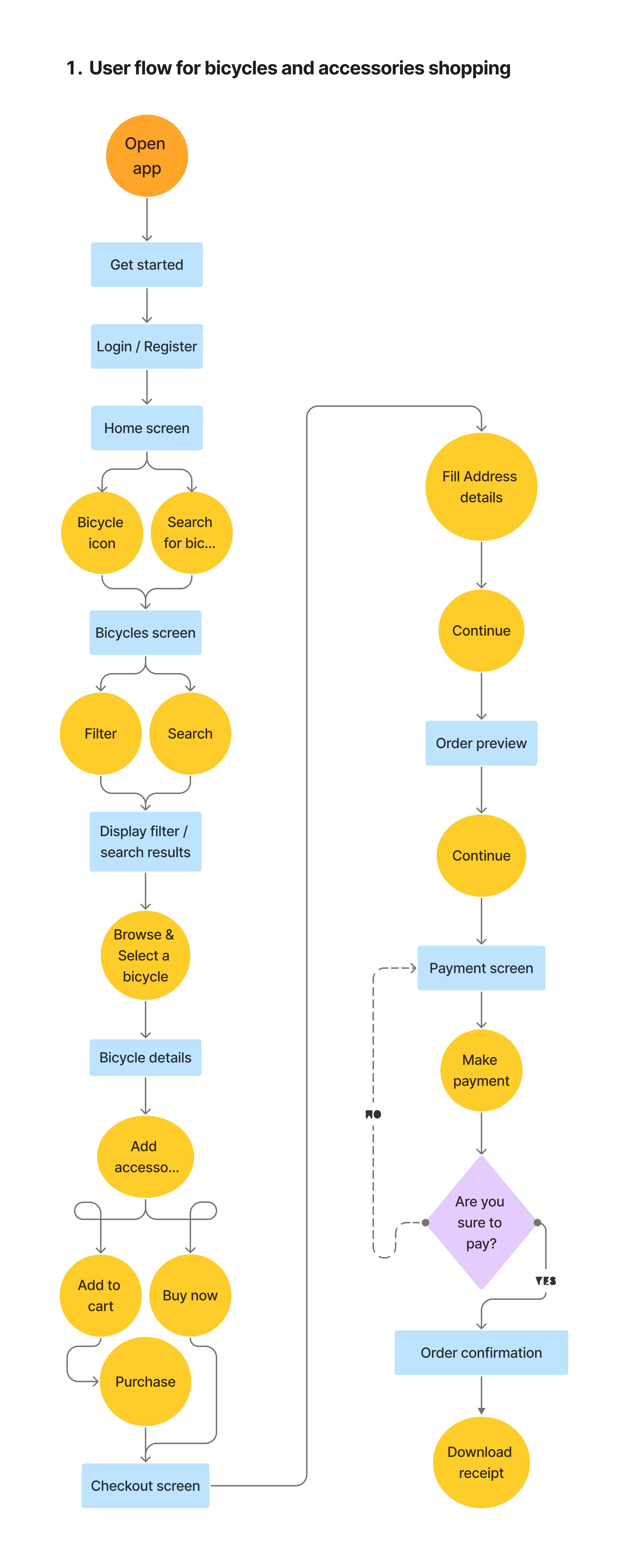
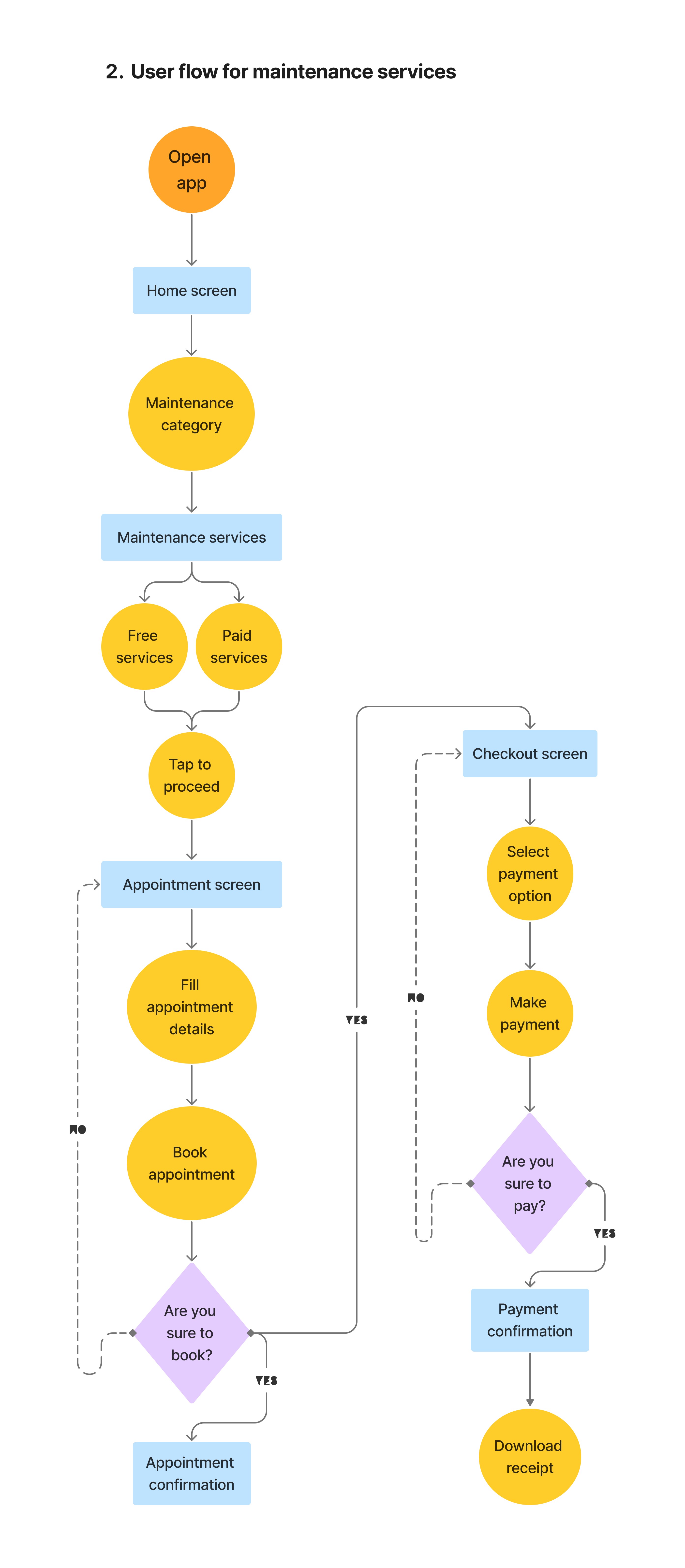
User Flow
Navigating the digital terrain, I charted two user flows, one for shopping and the other for maintenance service. Each flow was refined to ensure frictionless experience, with a clear path from discovery to delight. Both user flows emerged organically, each step-in user journey seamlessly connected.
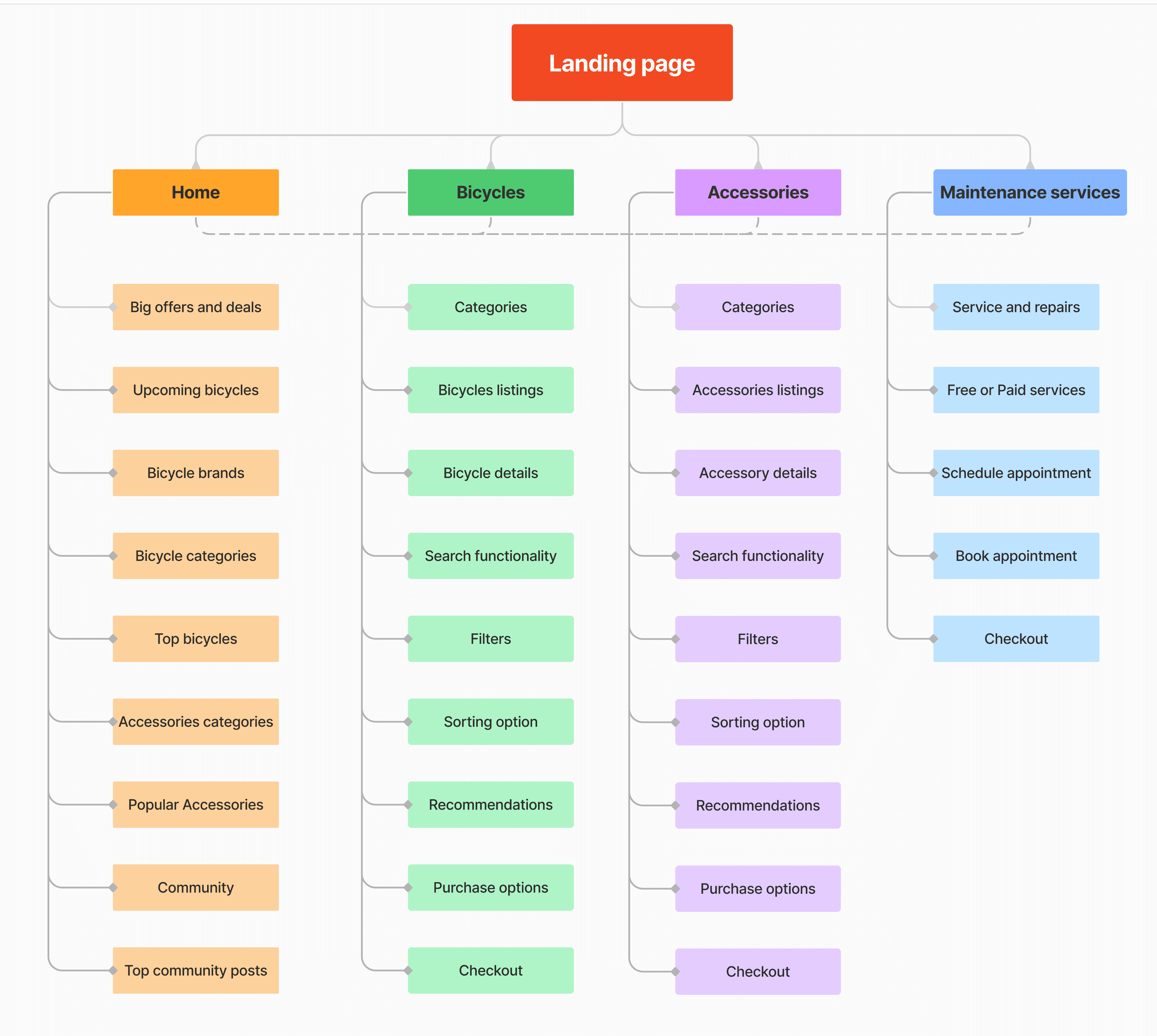
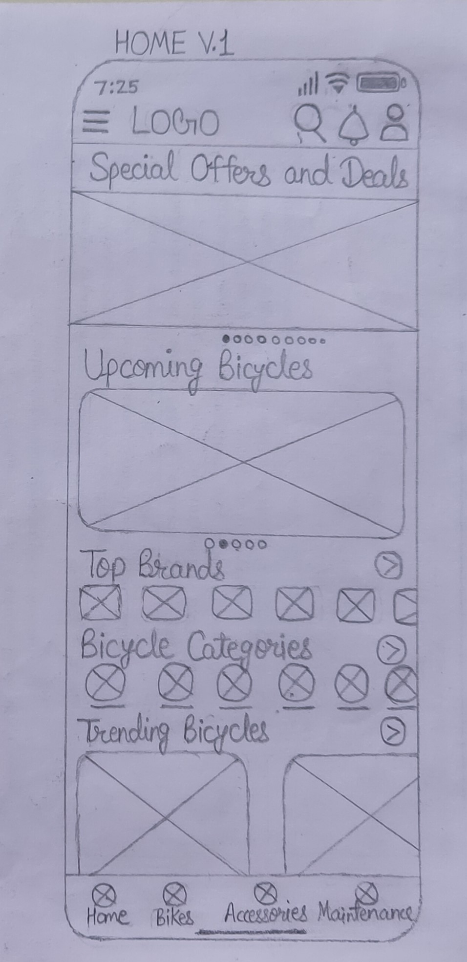
Information Architecture
With a wealth of data at our fingertips, I crafted a clear and intuitive information architecture. Clear hierarchies ensured that users like Shaurya and Arnav could effortlessly navigate from selecting a bicycle to joining a community ride. The skeletal structure of the app is devised, with a focus on intuitive navigation.
Storyboarding
To bring our design to life and understand user deeply, I embraced big picture storyboarding. Shaurya's story unfolded on our sketches, illustrating his discovery of CycleEase and the transformative journey that followed. The narrative, sprinkled with moments of frustration and joy, provided a blueprint for seamless app interactions.
Evolution of the Solution
Digitization breathed life into our vision. User can now virtually navigate through the app, exploring a curated selection of bicycles, envisioning maintenance services and connecting with fellow cyclists. Transitions, interactions and visual hierarchy were fine-tuned aligning with users' needs. Now high-fidelity wireframes emerged, embodying the app's aesthetic and functionality. A splash of color, imagery and brand personality infused life into the mockups, ensuring the visual appeal resonated with the target audience.


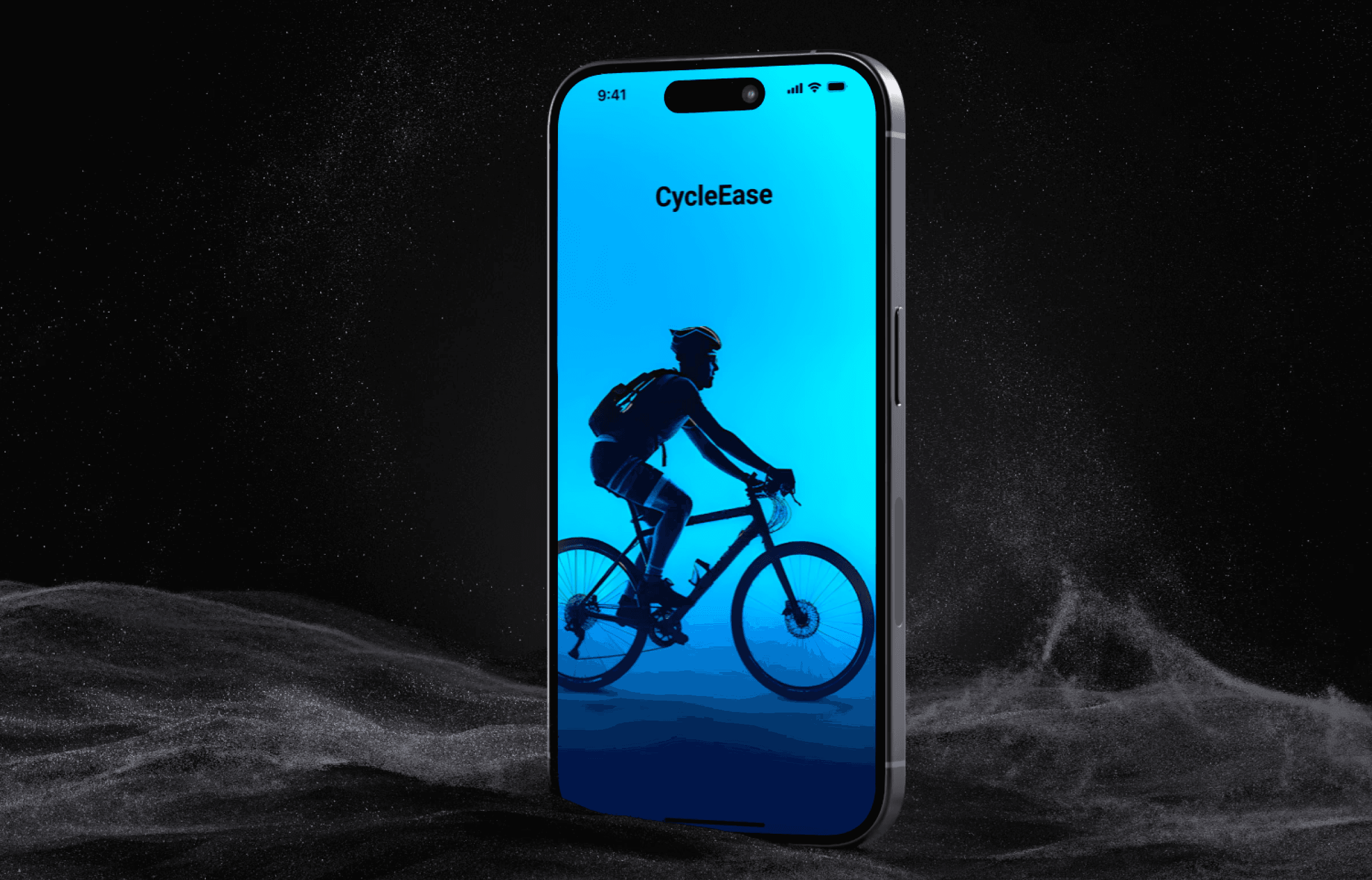
High Fidelity Prototype
Every pixel was meticulously placed in high-fidelity prototypes. Realistic interactions, vibrant visuals, and an intuitive UI set the stage for the final unveiling. The app now mirrored his needs- a seamless blend of shopping, maintenance and community engagement.
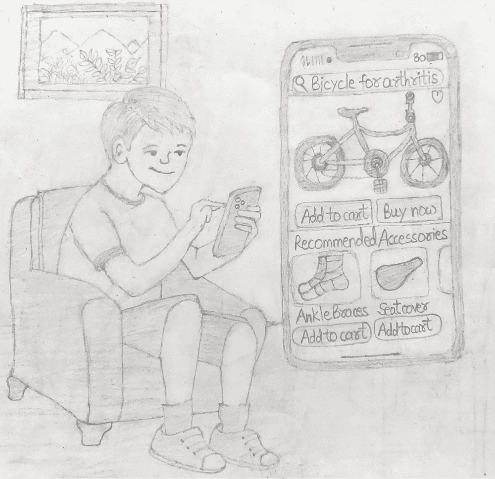
Purchase bikes & accessories as per users' needs.
Book bike maintenance service and schedule appointment
Impact
Users with health challenges now have a dedicated space for cycling, fostering a series of inclusivity and empowerment.
The app has become a hub for cyclists worldwide, breaking down barriers and encouraging the growth of a global cycling community.
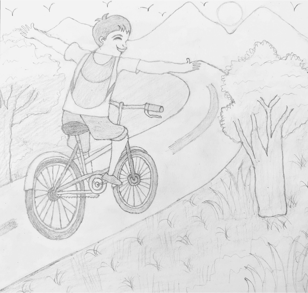
For users like Shaurya, CycleEase isn't just an app- it's a companion on their journey to better health and wellness.
By integrating shopping, maintenance, and community, CycleEase has established a cohesive environment, fostering a sense of community among cyclists worldwide.
CycleEase has set a new standard in the market by providing a one-stop solution, influencing competitors to adapt and innovate.
Learnings
Understanding the user's journey and pain points is paramount. Every design decision should resonate with the user's needs and aspirations. A well-mapped user journey is foundational to a positive user experience.
Consistent visual design language enhances usability and brand recognition.
Putting the user at the center of the design process is paramount.
Storyboarding, user flows, and how might we ideas spark creativity.
The design process doesn't end; it evolves. User feedback, market trends, and technological advancements should be embraced for continuous improvement.